Entity Pages
There are three types of entity pages: Create pages, Detail pages, and List pages.
Create pages establish the basic format for the data element. Detail pages are based upon the Create pages and contain the different data that is input by end users. And List pages provide a grid with selected data.
For example, these pages are often used to establish the framework for a form to accept user data (i.e., Create page); a way to see the data and add more as necessary (i.e., Detail page); and a grid that shows a snapshot of the most important data from multiple forms (i.e., List page).
Each page type has several dialogue boxes that define the settings and user interface.
These Entity Pages can be established as part of the creation of Entities (on the second step of the wizard). Otherwise, they can be created in UI > Entities with the (+) link in the subsection header (or + Create at the top of the side panel, or Ctrl + Shift + C); each has a short dialogue box that requires the Entity to which the page will be attached and the name for the new page.
Create and Detail Pages
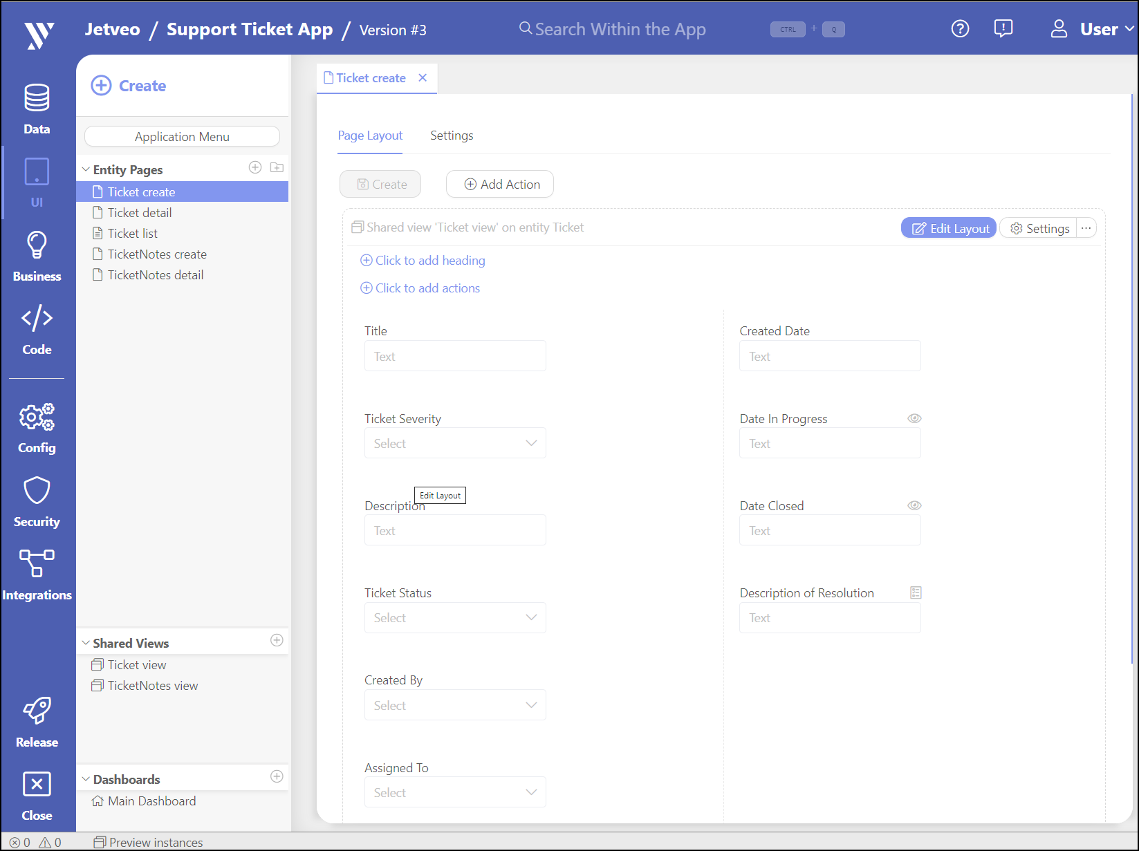
Create and Detail pages are similar. If they were created as part of the Entity creation process, then many settings are prefilled. (The screenshot below is from the Support Ticket tutorial.) There are two parts: Page Layout and Settings.
Page Layout tab
The Page Layout tab is shown by default.

The Page Layout Editor consists of several sections. The top section can have Action Buttons. Two sections are available for individual Views. The upper section is dedicated to views above the Tabs. And the lower section is dedicated to the Tabs and their views.
Actions
Buttons can be added to the top of the page. There is an Update button by default that allows the app users to save changes to an entity record. Automatically created detail pages may have a button with a link to the List page of a related entity. Click Add Action to add another button.
GeneralTypes – There are several types of Actions:
- Execute entity command – Executes a business command of the Entity command type, with the current entity record as a model
- Link List Page – Links to the List page of the related entity
- Link Create Page – Links to the Create page of the related entity
- Link Detail Page – Links to the Detail page of the related entity
- Link Custom Command Page – Links to a page for a custom command. Allows you to pass any parameters into its model.
Delete System Command – A system command to delete an entity that redirects to a specific page.
Entity Command – Choose from commands related to the entity.
Enabled Expression – Condition used to check if the user is allowed click the button
Visible Expression – Condition used to check if the user will see the button
UI
Button Label – Name used to identify the button.
Icon – Choose an icon from the drop-down menu.
Style – Choose from Button Normal, Button Primary, and Link.
Confirmation Question – Establish a requirement for the user to confirm their intent as a safeguard against making an inadvertent error.
Parameters
Parameters can be set for Create pages or for custom commands that have some attributes or references in its model. This is useful for assigning parents for child entities, when creating the child entity from the parent page, or for assigning current users as creators.
Attribute – An attribute that will get a value
Value – An expression to define the assigned value
If there is a Shared View layout, it is show here.
Tabs
Tabs let you group views into logical units, like for Attachments or Change Logs. Click Add Tab.
Label – The label of the tab
Tab label expression – Define a dynamic label. Overrides “Label” (see above).
Tab icon – Select the icon shown next to a tab label
Tab Visibility Expression – A security condition to show the entire tab
The most common uses include checking if the user has a relevant security claim or hiding/showing tabs depending on an entity workflow state.
The Page Layout Editor
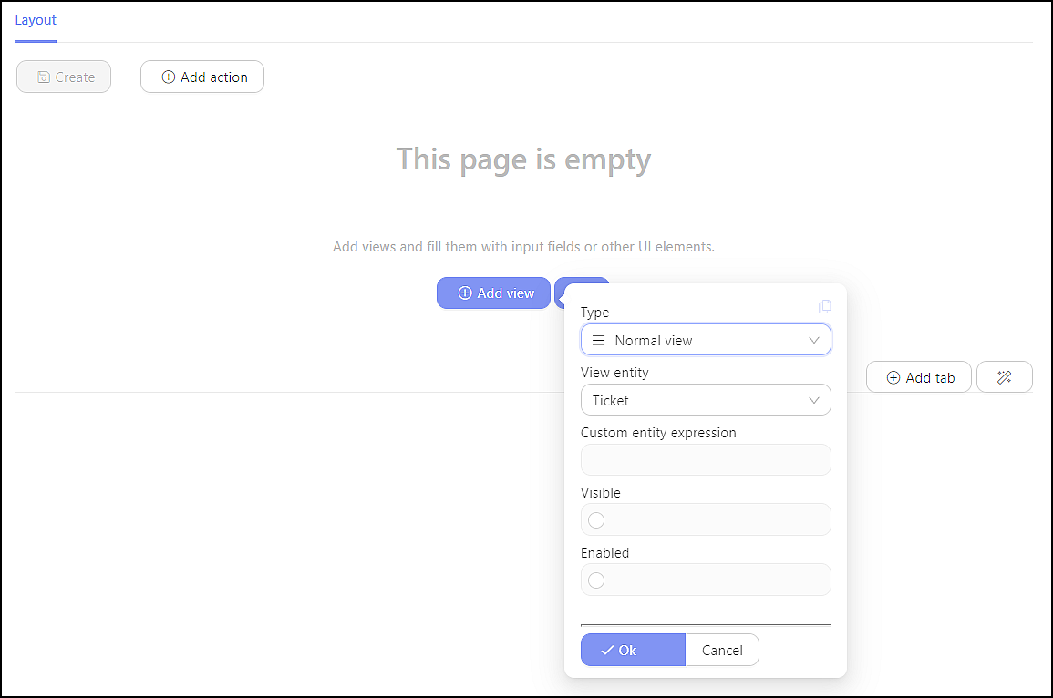
This is the place where the elements are positioned to be shown on the user interface. The first visit to a Create or Detail page includes the following (later visits will have additional links to access saved elements). Click [Add View]
Layout Settings
 When adding a view to a page we recommend using our
 Magic Wand wizard because it streamlines the process for common cases.
If you decide to add a view yourself you are presented with these options:
Type – Select from Normal or Shared View (if available). Select Normal when creating a new view. Select Shared View if you want to import a previously created layout.
View Entity – Select the entity connected to this page. A related entity is preselected. If you want to add the view of another entity, specify it in Custom Entity Expression (see below).
Custom Entity Expression – An expression that defines the entity record. Usually a directly referenced entity: (myEntity, db, ctx) => myEntity.ItsReference If empty, this defaults to the page-model identity expression.
Visible – A security condition to show the view.
Enabled – A security condition that has to pass if the app user will be allowed to edit the data fields.
Both security conditions are usually used to check if the user has relevant security claim:
(entity, db, ctx) => ctx.User.HasClaim(App.Security.Claims.MyClaim)
or if the entity is in a specific workflow state:
(entity, db, ctx) => entity.currentState == Codebooks.MyCodebook.DesiredState
Click on a created view to open it's Page Layout Editor.
Click Add View Magic Wand for shortcut options (which are available according to the state of the app):
- Create empty view for the entity
- Add shared view for the entity
- Create child list for the child reference of the entity
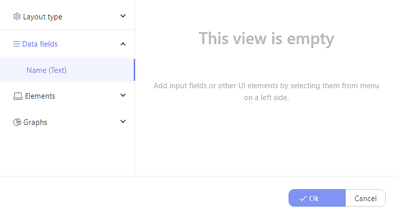
Define the Layout
 Layout Type – Select from two columns, three columns, four columns, and Field grid.
Data Fields – The attributes of the entity are made available for placement on the page. Click the attribute to place it in the Layout field, then drag and drop the fields to determine the order and placement.
Elements – Select from Placeholder, Notification Box, Data grid, Kanban Board, Nested View, Comments, and Document List. (For more detailed information about how to use individual elements see the Components section.)
Graphs – Progress Bar will show the progress of an operation from zero to complete. (For more detailed information about Graphs see the Components section.)
Data fields
Expressions for the Data Fields can be further defined. Click on the Data Field name to access additional features. These are the UI components for all of the attributes and references related to the entity. Click one to add it to the view. Drag and drop the element to the desired location. Click it to show its options. Most options are common for all types of fields. Some may be specific to that field.
General
Label – Label for the UI element. Uses the name of the attribute/reference by default
Tooltip – Adds a tooltip for the app user, when hovering over the label. Useful for on-screen instructions.
Visible Expression – Security condition to show the field
Enabled Expression – Security condition to update a value in the field
Extras
Simple text, numerals, and decimal fields can be defined.
Value Suggestion – Suggested value for the entity. Can be an expression whose value changes whenever its dependency is updated.
Left Add-on Expression and Right Add-on Expression – Create an expression that shows next to a value of the input field. Often used to display a unit of measurement. For strings use FieldAddon.OfString() and for icons use FieldAddon.OfIcon().
Validations
Specific validations can be added to the Data field.
Click + Add to generate one.
Severity – Choose from Info, Warning, and Error
Message – Type the text that will appear for this situation.
Valid Condition – Establish the conditions under which this validation is valid. The default setting is: False.
Is Applicable – Establish when this validation will apply. The default setting is: True.
Alternatively, click the Magic Wand to select an established entry. Click Edit to customize it.
Subsequent Visits
After data has been added to the Page Layout Editor, additional links appear:
Edit LayoutSettingsMore, which has three available functions:
-- Arrow keys to adjust the order of multiple layouts
--Make Sharedtakes the layout and makes it available for other pages. This is most often used to keep the layout consistent between Create and Detail pages.
--Delete
Click to Add Heading allows for a header to be added to the top of the layout.
Click to Add Action adds an action to the heading. (See above for specifics.)
A preview of the layout of the Create page will be shown in the body of the Layout section. Hover over the layout and click to edit it.
At the bottom of the page, tabs can be added for Attachments or a Change Log.
Click Add Tab
Click the Magic Wand to create a Child List tab
Settings tab
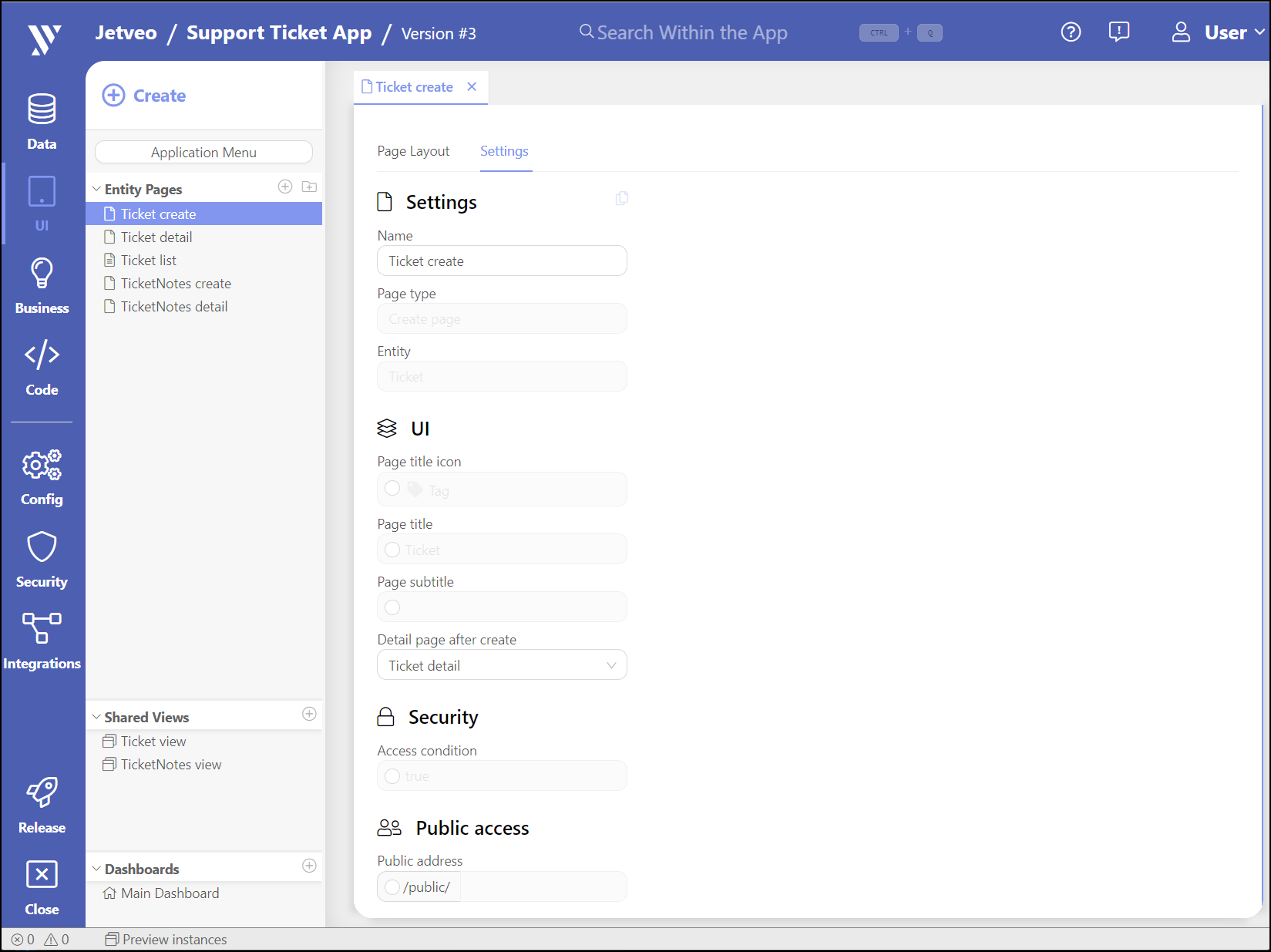
The Settings tab shows the basic settings.

General
Name – Name of the page. Shown in the App Builder only.
Page Type – Listed as either a Create or Detail page for the entity record. Informational purposes only.
Entity – The entity to which the page is connected. Informational purposes only.
UI
Page Title Icon – Icon shown in the title of the page. Overrides the default entity icon.
Page Title – Title of the page. Defaults to a name of the entity.
Page Subtitle – Subtitle for the page. Empty by default.
Detail Page After Create – Redirects the user to a specific detail page after the creation of a new entity record.
Security
Access condition – Defines the conditions under which a user can access the page.
This is usually used to check if the current user has relevant claim:
(ctx) => ctx.User.HasClaim(App.Security.Claims.MyClaim)
Public Access
Public Address – Exposes the page to public access.
List Page
List pages present the collection of entity records. These pages take the form of a Data Grid with an editable group of Action buttons (see below).
General
Name – The name of the List page.
Access Condition – Define when the user can have access. The default setting is: True
UI
Page Title Icon – Establish an icon to accompany links for the List page, if necessary.
Page Title – Adjust the name of the List page, if necessary. The default setting is that of the related entity.
Page Subtitle – Add a subtitle, if necessary.
Rows per Grid Page – Define how many rows will appear on a single page of the List page. Select from: 15 (default), 20, 30, 50, and 100.
Display as Report – Select from Yes or No.
Actions
Actions are created as part of the Entity-creation wizard. They can be adjusted and customized.
Click Add Action to add a new action.
Data
Entity – The entity to which the List page belongs.
Data Source – The definition for the source of the data. It defaults to: db.EntitySet
Columns
Click Add Column. Select the options that are available for the list.
Click Edit to adjust the Expression and Display Expression for the row.
The Default Column for Sorting can be established and set at Ascending or Descending.
The Actions column incudes Edit, Delete, and arrows to arrange the order of the columns.
Highlights
Specific parts of the List page can be highlighted.
Click Add Highlights.
Name – Establish the name for this highlight setting.
Icon – Choose from dozens of icons.
Color Shading – Choose from None, Primary (blue), Secondary (grey), Success (green), Warning (orange), Danger (red), and Info (green)
Use Bold Text – Choose from True or False (default)
Use Italic Text – Choose from True or False (default)
Highlight Condition – Define when the highlighting will go into effect.
Filters
Click Add Filter
Name – Establish the name for this filter setting.
Data Type – Choose from Text, Number, Boolean, Date, Date Range, User, Codebook, Codebook Collection (Child reference), Entity, and Entity Collection (Child reference).
Constraint – Choose from Equal (=), Not Equal (!=), Starts, Ends, and Contains.
Filtered Expression – Expression that represents the value on which the filter is applied.
Click the Magic Wand to select from the list of entities.
Filters Layout
Define the layout for the Filters. This is similar to the Layout Editor of Create and Detail pages.
Commands
Click Add Command
Type of Command – Choose from Business Command and System Command.
Command – Choose from Commands that were established in the Business > Commands sub-section.
Label – The label for the Command, if necessary.
Icon – Choose from dozens of icons.
Enabled Condition – Security condition to update a value in the field.
Visible Condition – Security condition to show the field.
Click the Magic Wand to select from existing options, like Delete Entity Command
Batch Commands
Click Batch Commands
Type of Command – Choose from Business Command and System Command.
Command – Choose from Commands that were established in the Business > Commands subsection.
Label – The label for the Command, if necessary.
Icon – Choose from dozens of icons.
Enabled Condition – Security condition to update a value in the field.
Click the Magic Wand to select from existing options, like Create Delete Command
